Creating a 8 bit Retro CV Page
30/12/2018
I grow up playing SNES (スーパーファミコン) and Sega Mega Drive (メガドライブ). My love for pixel graphic games are absolute. Therefore it made sense for me to build a website in that style to represent me as the geek I was growing up and the person that I still am.

One of my first games I ever played was Sonic. The old sonic games for Sega Mega Drive has aged well and are still really enjoyable. In that spirit I decided an afternoon to have a page that had a side scrolling background with some basic information. Basically just some links to LinkedIn and Github where my real CV is :)
My initial inspiration for the page was when I stumbled upon NES.css from reading the Frontend Focus newsletter. It was so simple and elegant and really touch my childish self. I just had to use it for a project. And why not use that style for a CV page?
Create a Profile Card
Add the NES.css to your <head>
<link href="https://unpkg.com/nes.css@0.0.2/css/nes.min.css" rel="stylesheet" />The next step is to create a container with a title using the NES.css framework.
<section class="container with-title">
  <h2 class="title">Oskar</h2>
</section>
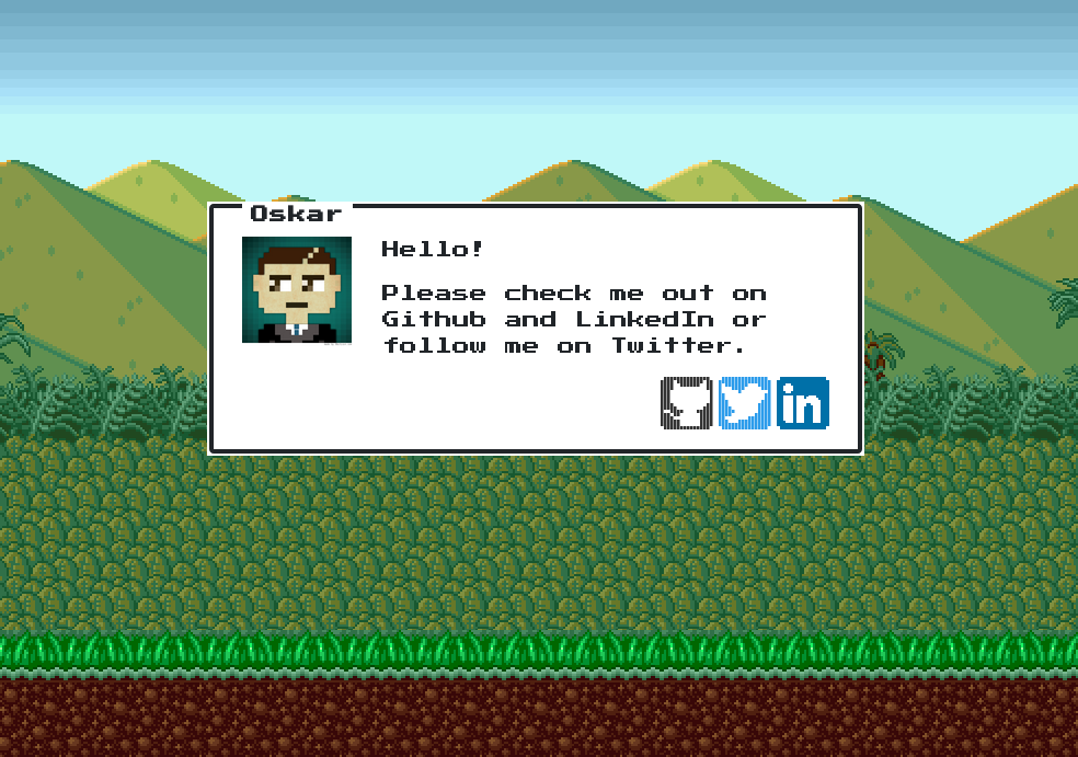
Then I will add a row with my Github picture and a encouraging text to navigate some of the sites where I actually have some content to show.
<section class="container with-title">
    <h2 class="title">Oskar</h2>
    <div class="row">
    <img src="https://avatars0.githubusercontent.com/u/2677573?s=460&v=4" alt="profile picture" width="100" height="100" />
    <div style="margin-left:28px;">
        <p>
              Hello!
        </p>
        <p>
              Please check me out on Github and LinkedIn or follow me on Twitter.
        </p>
        </div>
    </div>
</section>

#styles.css
.row {
  display: flex;
  flex-direction: row;
}
The next row will be a list of icons with links to the services I want the visitors to navigate to
<div class="row right-aligned">
     <a href="https://github.com/MrOggy85" style="margin-right:5px">
         <i class="icon github is-medium"></i>
     </a>
     <a href="https://twitter.com/oskarlindgren" style="margin-right:5px">
         <i class="icon twitter is-medium"></i>
     </a>
     <a href="https://www.linkedin.com/in/oskarlindgren/">
         <img src="assets/linkedin.png" width="48" height="48" />
     </a>
</div>

#styles.css
.right-aligned {
  justify-content: flex-end;
}
The result:

Okay so that very informative and pretty cool. But, it's not very engaging. I needed some kind of visually stunning effect in the same spirit. I needed a side scrolling background!
Creating a 3 layer Side Scrolling Background
To create a good depth perception 3 level of backgrounds scrolling at different speeds is good enough. And we can achieve this with only CSS.
First the HTML
<div class="wrapper">
    <div class="mountains"></div>
    <div class="trees"></div>
    <div class="grass"></div>
</div>
For the background images I found some really nice pictures at a Fandom site called Super Mario Bros X Wiki. I needed to adapt the pictures a little bit since the image will repeat 3 times at the x axis to create the illusion of scrolling (if you have a really wide picture you don't need this).
To accomplish the scrolling effect we will use animation and @keyframes.
Let's start with the first layer which will be the mountains in the far back.
.mountains {
  position:absolute;
  top:0;
  bottom:0;
  left:0;
  right:0;
  background:url('assets/mountains.gif');
  background-repeat: repeat-x;
  animation: mountains-slide 60s linear infinite;
  width: 3072px;
}

@keyframes mountains-slide{
  0%{
    transform: translate3d(0, 0, 0);
  }
  100%{
    transform: translate3d(-1024px, 0, 0);
  }
}
The width is 3 times the image width size and the translate3d property tells
it to move to the left and repeat infinitely. That's all there is to it. Then
you can just add as much layers as you want, position them absolutely and
experiment with the animation speed to create different velocity to get that
depth perception we are trying to achieve here.
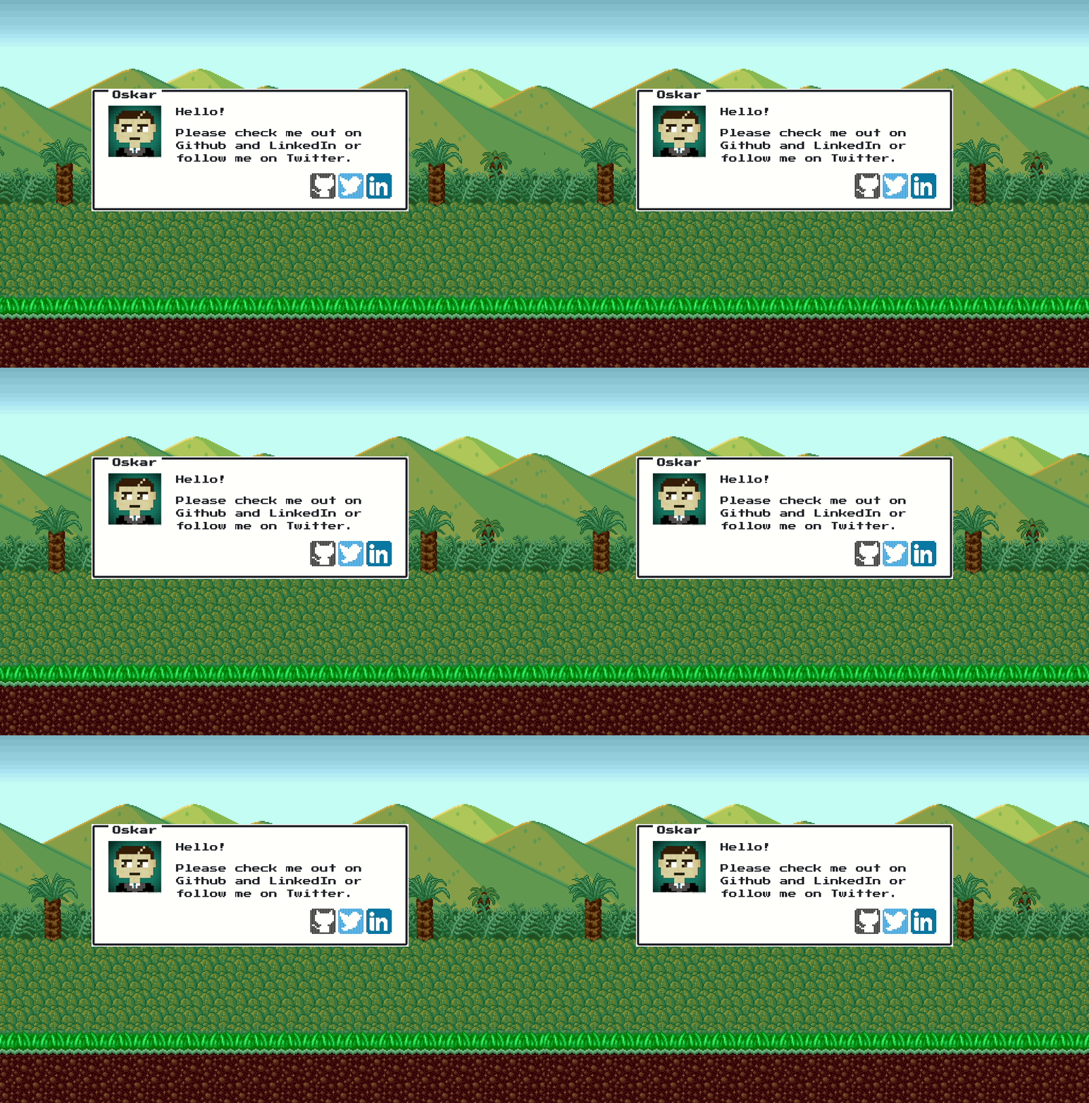
The end result:

View the full source at Github.
Checkout it out live at https://www.oskarlindgren.se